Name: Google Labs: Books nGram Viewer
Platform: Internet browser
Where/how I came across it: Googling Google on Google News.
What it does: Using Google's extensive digital book collection, this lab experiment graphs the frequency of occurrence of any phrase or word. Multiple phrases/words can be compared.
This application is similar to Google Trends, a service that shows trending topics by graphing a search term's popularity over a period of time, as a proportion of all searches. For example, here's a Google Trend graph of "osama bin laden", over the last 30 days.

If interested, below is a close up on Obama and Harper, who were clearly overshadowed by the news of bin Laden's death.

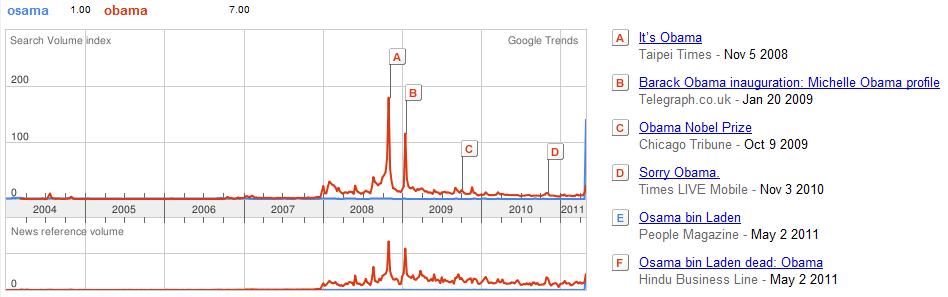
Google Trends allows you to go as far back as 2004, when Google was about half its current age. Here you can see obama vs. osama again, where Obama's peak on election day '08 marked his most popular day in terms of Google search.
On the other hand, Google's nGram Viewer brings "trend searching" to a time before the Internet. Since Google has digitized many books and documents from the last two centuries on Google Books and other related projects, the database can be used to create similar graphs over a much longer time period. The nGram viewer is one of several "Google Labs", a collection several side-line projects, or experiments, that are usually created out of sheer interest.
Here's a Google nGram for written references to "tiger" and "lizard", from 1800 to 2000. Interestingly, tigers are nearly twice as popular as lizards in the early 19th century, but the two converge and follow a similar path for much of the 20th century. Note that both graphs show similar ups and downs.

Lastly, here's a Google nGram I used for a presentation on Darwinism and scientific racialism. You can see the term "The Origin of Species" surge after Darwin's famous publication in 1859, reaching its peak in 1900 with several references in German nationalism texts. The term "racialism" was first introduced during this peak. You can also see a surge in the terms of "superior race" and "racialism" during the Second World war.

[I didn't include the term "racism" because its use in literature didn't really take off until the 1960's, while the bulk of my presentation focussed on the decades between the Origin of Species and WWII. Furthermore, books on racism jumped after the 70's, and would easily normalize the other three terms to flat lines, but here's a link if you want to see it.]
I'd definitely suggest trying Books nGram Viewer if you want to show correlations and trends between two or more terms for research purposes, or just if you're bored and like looking at graphs. Have fun!
No comments:
Post a Comment